2022 Art Museum Staff Demographic Survey Dashboard
Last year, Ithaka S+R, in partnership with the Association of Art Museum Directors (AAMD), the American Alliance of Museums (AAM), and with funding from the Mellon Foundation, was able to launch the third cycle of the Art Museum Staff Demographic Survey.
Filling out this survey can be time intensive, as rather than survey staff directly, we ask that museums submit data that has been recorded in their human resources system. This requires museum directors or their designee to fill a spreadsheet with relevant data for all current museum employees.[1] Widespread participation allows us to gain a clearer snapshot of staff demographics in the sector. To help incentivize participation, we offered each museum a free dashboard report so that they could compare their institutional data to the aggregate results of all 328 participating institutions. In April, we sent out dashboards to each participant. Below we describe how the dashboards were created and how they can help museums with their strategic decision making.
Dashboards as Research Outputs
The individualized reports provide unique insights specific to each institution, helping museum leadership identify areas for improvement and make data-driven decisions that can lead to desired outcomes. This can help museum leaders, staff, funders, and researchers contribute to an informed discourse on issues around diversity, equity, inclusion, and accessibility. With individualized dashboards, museum leaders are able to compare their own museum’s data directly with that of other participating institutions in aggregate, enabling them to track their DEAI progress, as well as inform hiring practices in the field.
The data dashboards were created through the coding language Python, which features data analysis, automation, and visualization capabilities and customization options that make it a valuable tool to continue to analyze data for future projects. In previous iterations of this project, institutional dashboards were generated using Tableau, a data visualization tool that while effective, is time intensive. We chose to use Python to create our visualizations as it allows us to quickly and efficiently produce complex data analysis and graphs for a large number of participating institutions. Through the use of a number of available Python libraries, we are able to create templates that can be easily modified and updated with new data, saving time while still producing visualizations that are tailored to specific institutions. In tandem with template creation, the automation components of Python can help streamline the process of generating a variety of graphs for data for different institutions. For more information on our methodology, please see Appendix A in the report.
What Is Included in the Dashboard?
Each dashboard includes seven graphs comparing each museum’s individualized data to that of all participating museums. The dashboards include an analysis of all positions according to their role within the institutions. The positions and roles analyzed include:
- Intellectual Leadership: museum leadership, curatorial, conservation, education
- Administration: membership/development, museum leadership, DEAI, finance, HR, IT, support/administration
- Building Operations: preparation, gardens/grounds, facilities, security, retail and store, exhibitions design
- Collections: conservation, curatorial, registrar, librarian
- Communications: publication/editorial, rights/reproduction, marketing/public relations, digital strategy
- Public Engagement: education, public engagement, visitor services
The graphs we include below compare a composite “sample” museum to the aggregate data of all participating museums (referred to as “national”).
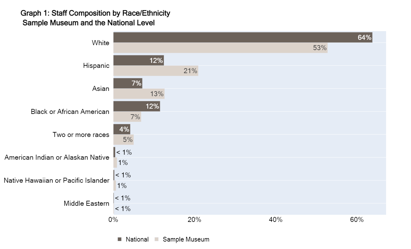
Graph 1 looks at staff composition by race/ethnicity.[2] For this graph, all of the darker bars add up to 100 percent, and all of the lighter bars add up to 100 percent. Currently, 64 percent of employees identify as White at the national level, while 53 percent of employees at the sample museum identify as White. Racial groups with less than 1 percent of staff represented in the survey are represented by “<1%”.
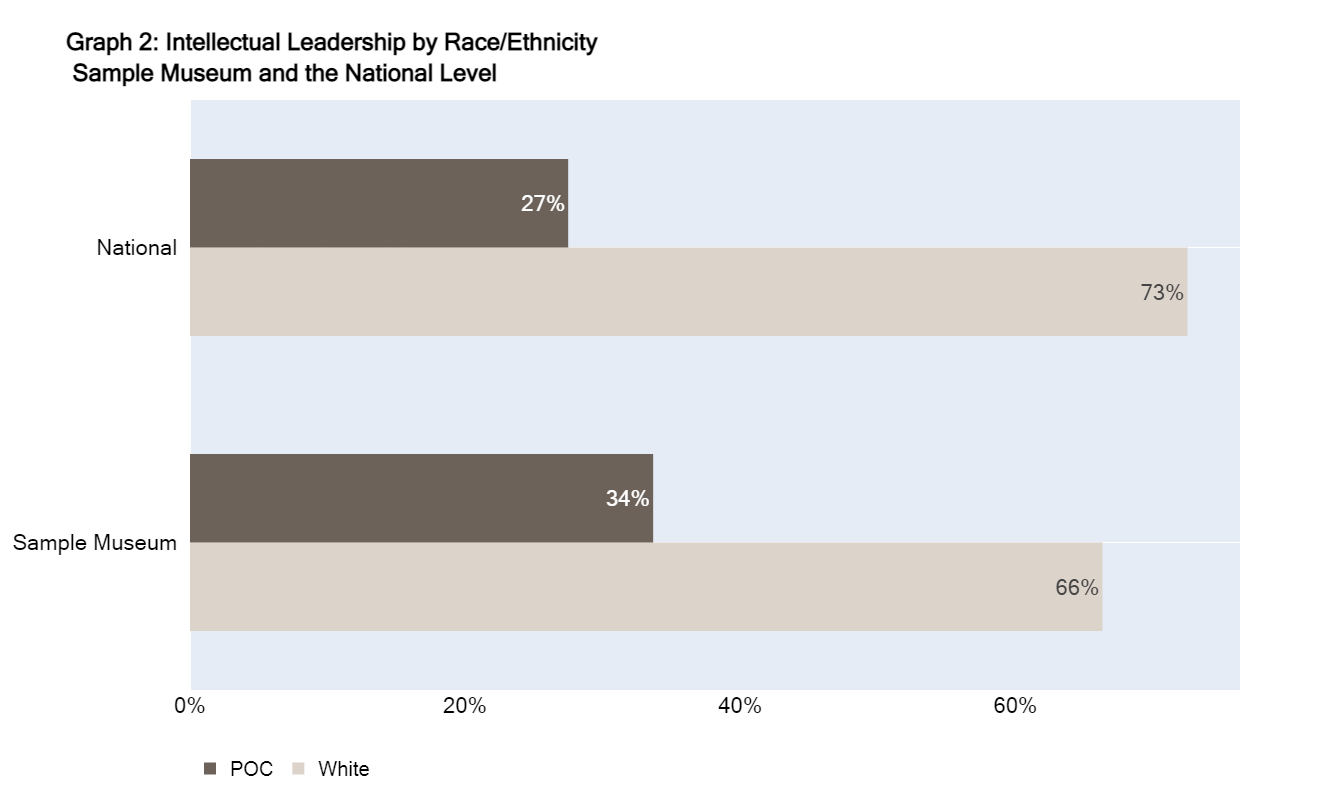
Graph 2 looks at POC and White employees whose job roles fall under the category of intellectual leadership.[3] For this graph, both of the bars for the national level add up to 100 percent, and both of the bars for the sample museum equal 100 percent. Twenty-seven percent of intellectual leadership positions at the national level are POC employees and 34 percent of intellectual leadership positions at museums in the sample museum are POC employees.
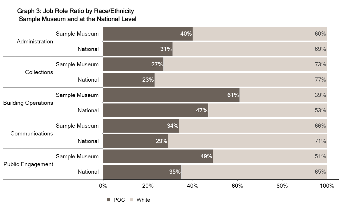
Graph 3 breaks down job roles by race and ethnicity. For this graph, each bar adds up to 100 percent. For example, 40 percent of all employees in administrative roles in the sample museum identify as POC, and 60 percent of all employees in administrative roles in the sample museum identify as White.
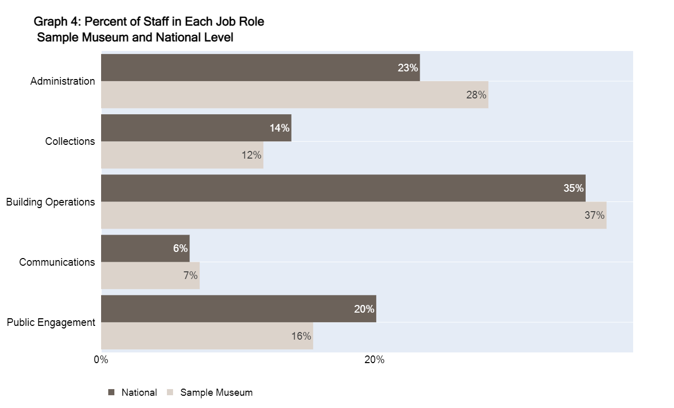
Graph 4 displays the percentage of staff in each museum role. For this graph, all of the darker bars add up to 100 percent, and all of the lighter bars add up to 100 percent. For example, 23 percent of all workers at the national level are in administration positions, while 28 percent of workers at museums in the sample museum are in this role.
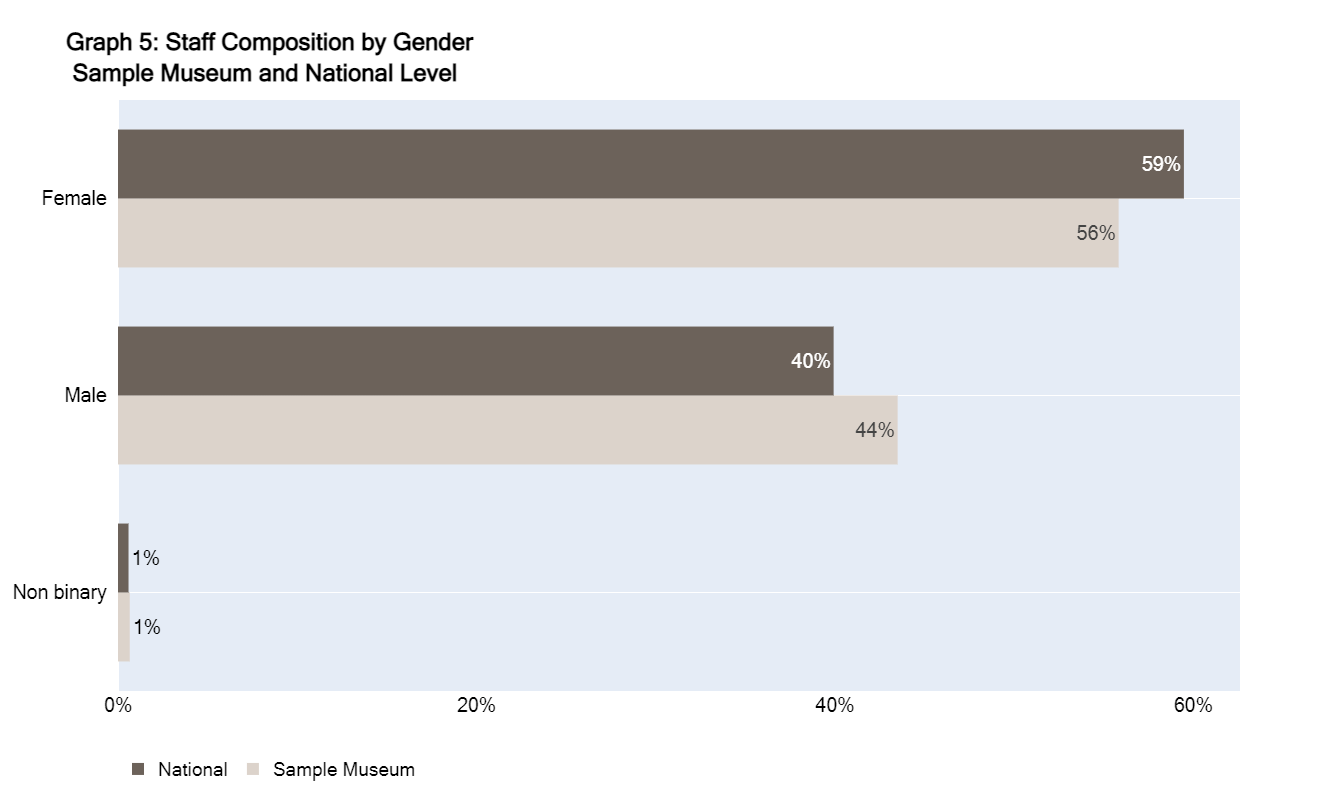
Graph 5 compares staff composition by gender between the sample museum and the national level.[4] For this graph, all of the darker bars add up to 100 percent, and all of the lighter bars add up to 100 percent. For example, 56 percent of workers in the sample museum are female, 44 percent are male, and 1 percent are non-binary.
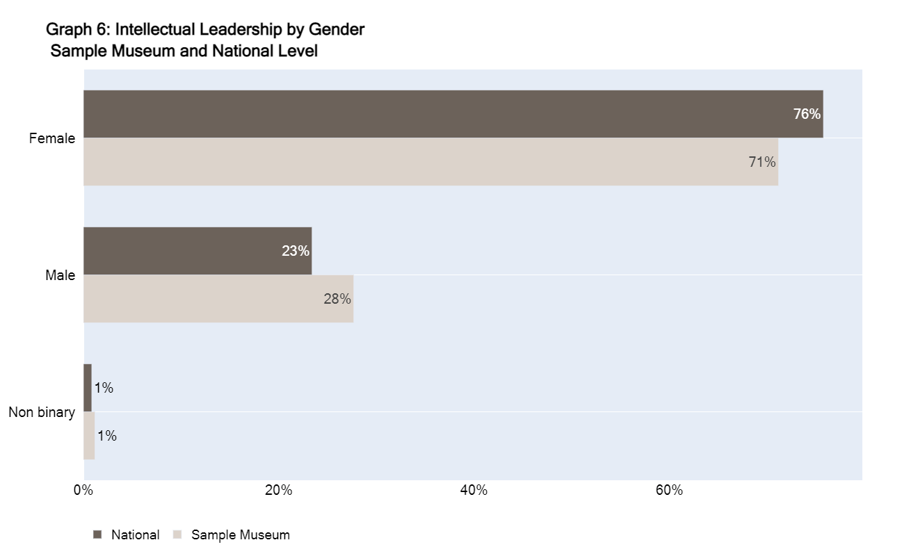
Graph 6 looks at female, male, and non-binary employees. For this graph, all of the darker bars add up to 100 percent, and all of the lighter bars add up to 100 percent. In the sample museum, 71 percent of intellectual leadership positions are held by female employees, 28 percent are held by male employees, and 1 percent are held by non-binary employees.
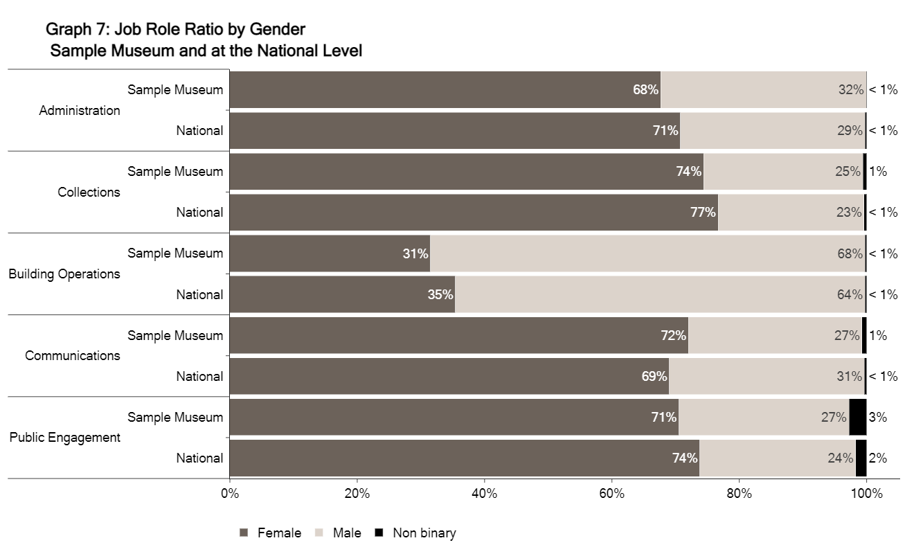
Graph 7 explores job roles by gender, comparing the sample museum to the national level. For this graph, each bar adds up to 100 percent. For example, 68 percent of all employees in administrative roles in the sample museum identify as female, 32 percent of all employees in administrative roles in the sample museum identify as male, and less than 1 percent of all employees in administrative roles in the sample museum identify as non-binary.
Reflections
The Art Museum Staff Demographic Survey has provided concrete data used by museum leaders to track staff changes in the field since its first publication in 2015. This has allowed for museum professionals to analyze demographic changes within art museums from a benchmark highlighting changes in staff retention, as well as the racial and gender make-up of art museums. With the ability to compare their own museum’s progress to others, the individualized dashboards can provide a useful perspective for museum leaders. The individualized dashboards can help further facilitate conversations amongst museum leadership regarding the overall state of representation in the art museum field.
If you have any questions pertaining to the dashboards or to the report, please contact Deirdre Harkins (deirdre.harkins@ithaka.org) or Liam Sweeney (liam.sweeney@ithaka.org).
_______________________________________
[1] We asked museums to provide the following information: Job Title; Position; EEO Job Category; Exemption Status; Employment Type; Full Time/Part Time; Education; Race; Ethnicity; Gender; Protected Veteran Status; Disability Status; Year of Birth; Year of Hire.
[2] The race and ethnicity categories present in our survey are based on the categories presented in the 2020 US Census. US Census Bureau, “About the Topic of Race,” Census.gov, 1 March 2022, https://www.census.gov/topics/population/race/about.html. However, in this cycle, we expanded on the Census categories and chose to add “Middle Eastern” as an option.
[3] Throughout the report we referred to the race and ethnicity of employees using the terms “White staff or employees,” and “POC staff or employees.” The POC acronym is used to include any individual who identifies as American Indian or Alaskan Native, Asian or Asian American, Black or African American, Hispanic, Native Hawaiian or Pacific Islander, Middle Eastern, and Two or More Races.
[4] We use the terms “male,” “female,” and “non-binary” in reference to how employees were identified on the survey instrument, as designated through their respective institution’s HR database.