Drawing New Directions for Research Data Services
In response to universities’ strategic need to provide effective data support services to researchers, Ithaka S+R launched the Building Campus Strategies for Coordinated Data Support project in February 2023. In the first two phases of the project, participants conducted an inventory of data services on their campus and interviewed researchers about their research data services support needs.
Spring 2024 marked the beginning of phase three during which participants will implement innovative strategies to assist researchers in navigating support services and/or pilot new models for collaborative service delivery. To prepare, we recently held two collaborative workshops for each of the project’s two cohorts. Grounded in design thinking, these workshops brought together representatives from university libraries, health sciences libraries, IT, interdisciplinary research institutes, and offices of research to ideate, brainstorm, and envision new ways to deliver services on their campuses.
In the first workshop, held over Zoom, participants were asked to create an empathy map and a user journey—tools commonly used in design thinking—for hypothetical users of data support services on their campus. Participants’ contributions were uploaded to Mural, where their work was visible to other cohort members.
Next, participants brainstormed new solutions to the obstacles facing research data services through drawing. After facilitators described the value of drawing as a tool in design thinking, participants were given a few minutes to make a drawing in response to the prompt: “What is a new way you could deliver a data support service?” Participants responded to the prompt by generating an impressive array of creative new ideas, which they then presented to the group.
Several participants sketched ideas for interfaces to help guide researchers to services, such as the “Data support triage center” with a “single point of access” proposed by one participant, where a researcher could be directed to a variety of campus resources. Another participant envisioned a virtual “interactive service finder” and sketched a web page that would direct researchers to the appropriate service. A third participant drew a plan for “organizing/facilitating peer mentoring” between “seasoned faculty” and “early career researcher[s]” that would serve a similar function.
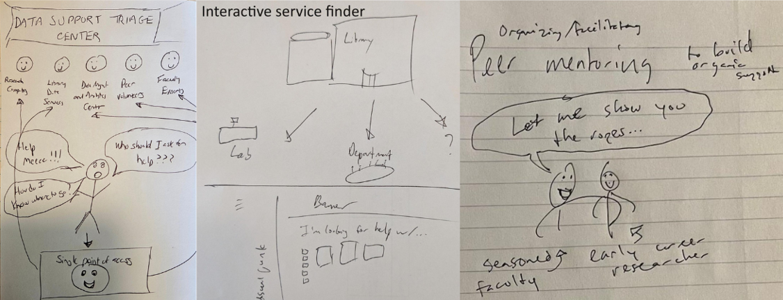
From left to right: “Data support triage center,” “Interactive service finder,” “Organizing/facilitating peer mentoring to build organic support.”
Two other common themes among participants’ ideas were displacing the geographical location of service delivery from a centralized location (e.g. library, research office) to an “outside” location, and designing a service delivery that was fun, especially accompanied by food. Participants drew ideas for a “data services mobile unit” that would travel to researchers’ locations; “brainstorming walks” outdoors to “talk about challenges, get support”; and a “virtual instruction session tailored to unique needs.” Other participants drew a plan for “Data sweets & meets” with different stations for food and data assistance; a similar “Data Cafe” in the “Commons” where researchers could co-work; and a “data management game night” as part of “new faculty orientation,” including an “NIH data policy board game” and “NSF compliance poker.”
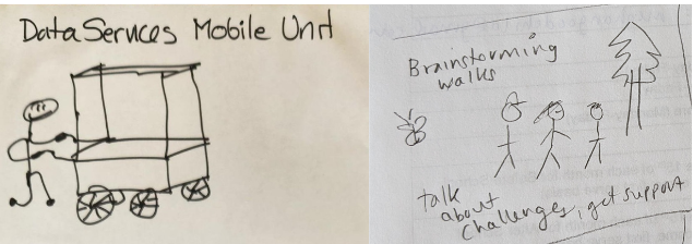
From left to right: “Data services mobile unit,” “Brainstorming walks.”
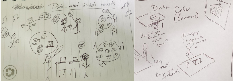
“Data sweets and meets,” “Data Cafe (Commons).”
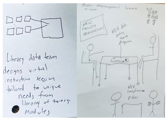
“Virtual instruction session,” “Data management game night.”
A few participants, motivated by a discussion of possible unmet social/emotional needs of potential users of data support services, envisioned programs to support those needs. One participant drew a hosted meeting for “peer-to-peer data (and emotional) support,” accompanied by a “hidden curriculum bookshelf.” Another participant drew a “problem breakdown coach” whose skills include identifying “technical” and “affective” parts of a problem.
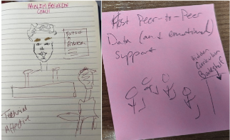
From left to right: “Problem breakdown coach,” “Host peer-to-peer data (and emotional) support.”
After each participant presented their ideas to the group, facilitators asked them to draw responses to a new prompt: “What would it take to make it easier for researchers on campus to navigate and take advantage of existing research data support services?” This exercise allowed participants to build on their own and their peers’ ideas from the previous round and produce more developed thoughts about informing researchers of and guiding them to services. For example, one participant designed a detailed plan to incorporate education about data support services into “new faculty orientation,” “current faculty orientation,” and “research admin orientation.” Another designed a walking tour among service providers, with stops at centers for “data science & AI” and “digital humanities” and an “open scholarship commons.” A third imagined “Research fests” including “mini golf in the library” where “something happens” at each hole. A fourth planned a “roadmap app” including an “interactive flowchart” showing each step in the “research ecosystem.”
![Image 1: A drawing on lined paper. At the top is written "Problem breakdown coach". Underneath it is a drawing of two people facing each other across a desk, one of whom has their back to the viewer. Beside the large central person who is facing the viewer is the text "Parts of a problem" with marks indicating a list. Possible list items "Technical" and "Affective" are written below the central person. Image 2: Drawing is labeled "A roadmap app (web app) of the research process and the libraries [sic] services". The subtitle is "Interactive flow chart like NYU Libraries". The drawing shows a circle with arrows representing the "research ecosystem". Each portion of the circle is labeled; at ten o'clock, "explore organize"; at one o'clock, "collect analyze"; at four o'clock, "output publication" (with an arrow pointing away from the circle); at six o'clock, "reusability". Image 3: Drawing is labeled "Orientation soup". In three vignettes, a person is shown presenting a slide show in front of a large audience. The three presentations are labeled "New faculty orientation", "Current faculty orientation" (subtitled "Rusty nail talks"), and "Research admin orientation".](https://sr.ithaka.org/wp-content/uploads/2024/05/Crop8.png)
From left to right: “Resources walking tour,” “A roadmap app (web app) of the research process and the libraries [sic] services,” “Orientation soup.”
![Drawing is labeled "Research fests". Subtitle "Mini golf in the library", accompanied by a circle with dark dots in it and the text "Something happens at @ hole" [sic].](https://sr.ithaka.org/wp-content/uploads/2024/05/image11.jpg)
“Research fests.”
After participants shared and discussed their ideas, the workshop came to a close with facilitators’ call for participants to bring the ideas they had generated back to their teammates as a springboard to develop a user-friendly interface to communicate existing data support services to researchers. As the project continues, Ithaka S+R will work with participating institutions to assess which ideas they plan to implement and strategize effective ways to bring these energizing and transformative research support ideas to fruition.
If you’re interested in learning more about the project or our design-informed workshops, please contact Ruby MacDougall (Ruby.MacDougall@ithaka.org).